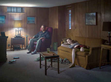
Gregory Crewdson – Cathedral of the Pines

593aa3f628882crewdson-slide-efn5-superjumbo

( Image by Gregory Crewdson  http://agenda.parisphoto.com – Accessed 01.07.17)

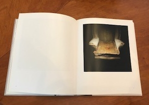
I visited the Photographers Gallery on Saturday (unfortunately not as part of the study trip) to see the exhibition of Gregory Crewdsons ‘ Cathedral of the Pines’. I have always been impressed by the detail to his work but seeing it in the flesh was so much better than expected, the printed page really does his images no justice.

The entire gallery was handed over to display his work which I don’t think I’ve seen happen before? Three floor of large-scale images to peruse.

All of the images I believe were taken in a small rural town in Massachusetts, at first I followed the images and seemed to link them in my mind to make a complete story then one image would break this chain. I retraced my steps and tried to see them as individual stories, I could make a multitude of different stories and endings to each and every image which I really liked. I felt that I could peer into and beyond the trees and look through windows and doorways. The images were amazingly sharp with such clarity I felt I could continue to look into the depths and find more secrets hidden there. There is such a painterly quality about them which I imagine Gregory Crewdson draws his inspiration from, certainly for lighting them.

There is a sense of darkness and foreboding throughout the exhibition, the images were unsettling in an interesting way. They each felt to me as though a crime or catastrophe had just occurred or was looming, I could feel sadness and sometimes regret. I wonder if this comes across because although they are somewhat intimate there is no direct eye contact from any of the subjects. I find that eye contact in life is important and reassuring , a lack of eye contact can make a person feel wary which may give me this sense of foreboding.

The only observation that I found a tad irritating was the re-use of all the props. I imagine that for each image viewed as a stand alone piece this would not matter but when viewed as a collection it takes away the belief that these could be real scenes and confirms to the viewer that they are staged. I would have liked to not notice the repeated use of props. There was also one image in which the bin or maybe it was an umbrella stand appears to be hovering in mid-air! Once I saw this I could not in-see it.
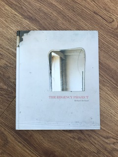


Richard Rowlands Regency Project

My book has arrived!

IMG_2536

It was both interesting and refreshing to see the building being renovated but still retaining its use as a home for homeless. So often these beautiful buildings are renovated into flats, marking a change in chapter for the building.

Richard Rowlands has captured the transformation in a subtle way which blends the architectural change with the people who reside there and its history. It does not seem to delve too deeply into why these people are there or their life story but you get a sense as you move through the book.

The clothes in bin bags hint at this being a temporary space for the occupant, or perhaps they came with very little. The building is run down and poorly kept but then its mission is not for profit. The instructions of support needed and the claiming of furniture tell their own stories. By the end of the book you can see and almost feel the life returning to the building, bright clean spaces, fresh walls and a spark of optimism.

My flat no longer has a tenant and I will not have time in the duration of this assignment to catalogue the renovations  however I did spot some similarities to some of the images I have taken.

The layers of wallpaper which you can see reveal runs of blue paint. I unmasked the football cards and layers to reveal runs of paint which appeared almost abstract.

The pattern on the walls are all that remain of what has been removed, I too had these after the square silver tiles had been removed.

IMG_2543

The chair, heavily stained and marked that has most likely seen and heard it all, steadfastly sat in the corner through all the years. My sofa in the flat was dishevelled and stained, with holes that I’m certain the cat climbed in to sleep.


Wolfgang Tillmans

Well I’m not quite sure what to make of the exhibition I visited today at the Tate Modern. Perhaps dragging my reluctant 13-year-old son , with hiccups!, to accompany me didn’t help but I found that I left feeling puzzled.  I wish I had researched Wolfgang Tillman beforehand to know more, the exhibition felt chaotic and disorderly but I am guessing this was the point?  I didn’t notice at first the photographs up high so I had to loop back slightly but they are difficult to view. So many varied images and no cohesive theme. I felt as though his attention flitted between things and I wanted to tune out the neighbouring images to focus on them individually. Further on in the exhibition I realised that the images were once perhaps grouped into collections as there were books that joined them together.

A lot of the images were not ones I particularly liked however there were a few that I either enjoyed or interested me. He has an eclectic vision and appears to have snapped what interested him or possibly amused him at that moment in time and they are presented here in one place for the world to see.

2017-05-27 13.09.42

It is only on reading the booklet from the exhibition that I learnt more about the technical marvels of the images, and his processes, there is limited information provided as you walk round, I presume so you can reach your own interpretation.

The images I partially liked were:

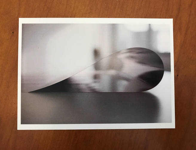
‘Paper drop’ – I liked the sharp edge of the curve with the out of focus background, I am aware it is three-dimensional but I can also see the drop as a flat abstract shape. It is remarkable that the reflections inside the drop match the shadows on the outside with such precision.

2017-05-27 13.10.22
WOLFGANG TILLMANS paper drop Prinzessinnenstrasse 2014

‘The state we’re in’ – a vast seascape where there is only a small sliver of sky left. You can just make out land on the top left when looking closely at the image in the exhibition but the detail is in the waves and texture of the ocean. It feels immense and is humbling, perhaps more so given the size of the image on display, you can sense the depth of the ocean by the depth of the image and the deep depth of field.

2017-05-27 13.10.14
WOLFGANG TILLMANS The State We’re In, A 2015

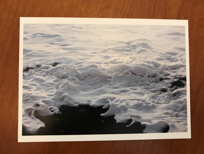
‘La Palma’ – the image caught of sea-foam could almost be a snowy landscape of melting, ebbing snow. The surf is so thick and milky and leaving behind it a vast black hole.

2017-05-27 13.10.02
WOLFGANG TILLMANS La Palma 2014

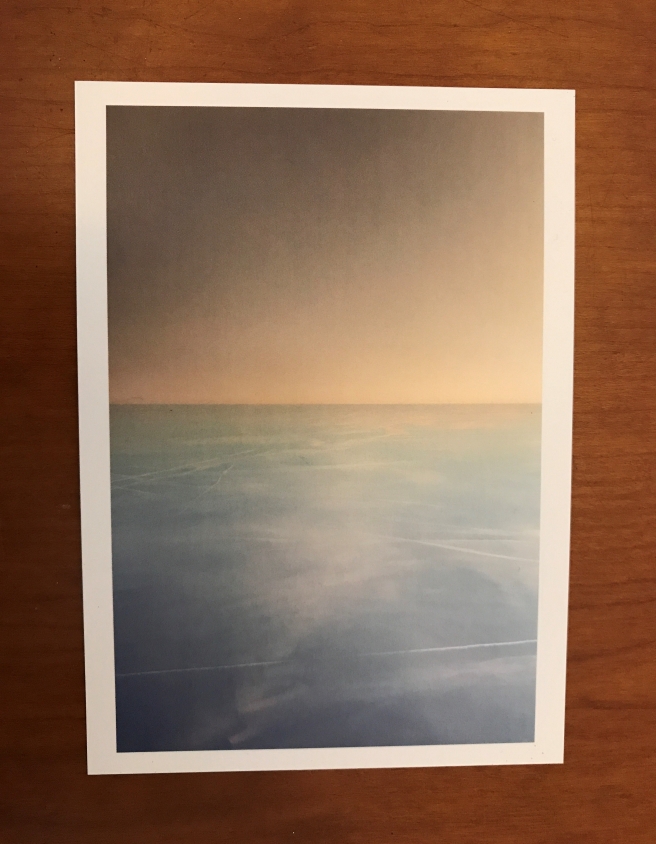
‘Transient’ – how many pictures have I taken of cloudscapes whilst on a plane? The title suggests either being of no particular place or transcending life. The colours were so muted and calm , a slice of an idyllic heaven perhaps.

2017-05-27 13.10.08
WOLFGANG TILLMANS Transient 2 2015

‘Blushes#136’ – I love the powdered texture of these images. This one appears to almost resemble hands on the other side of the paper trying to break through. It is a bit like ink blots where you can make and see different things. I am intrigued by how these could have been created?

2017-05-27 13.09.56
WOLFGANG TILLMANS Blushes#136 2014

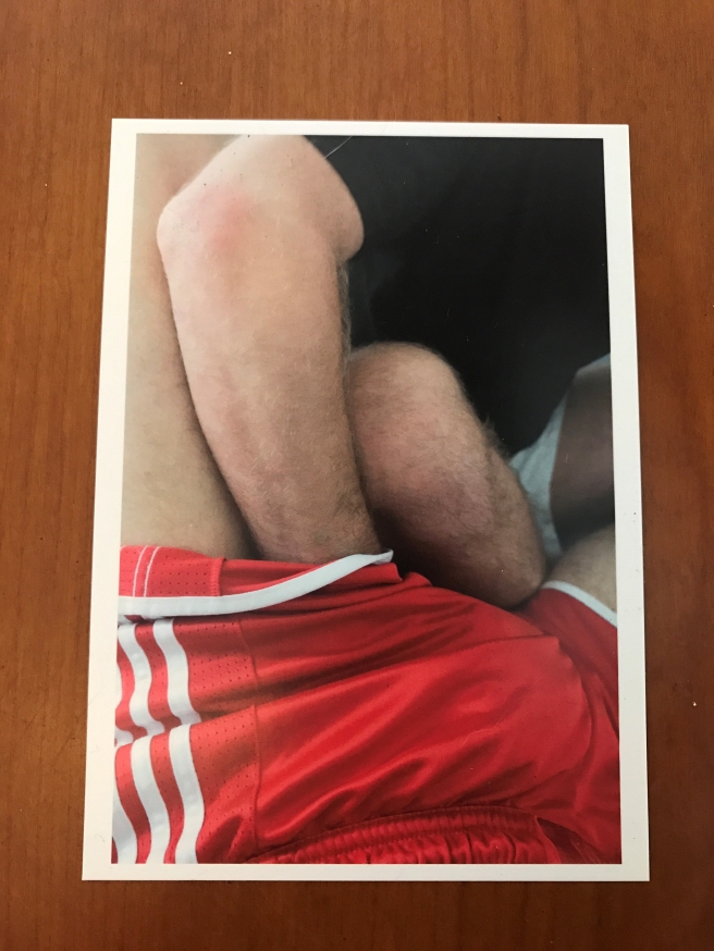
‘Arms and legs’ – I found unsettling, it is apparent that the hand belongs to a different person to the legs and I understand this collection is about sexuality but the fact that I can’t see the faces or expressions troubles me. Perhaps because it left my brain with the question…are they are happy or willing? It makes it feel violating , groping, whereas the truth may be that they were at ease, consenting and enjoying the affection.

2017-05-27 13.10.37
WOLFGANG TILLMANS arms and legs 2014

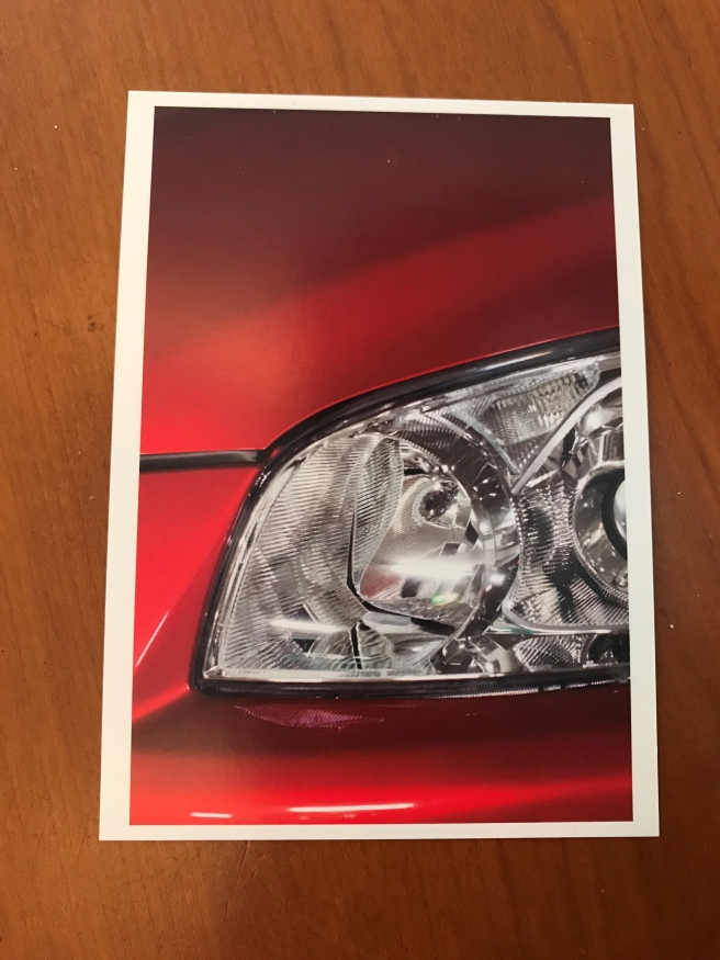
My son liked the image ‘Headlight’ (he does like cars!) But it was interesting to find out that he collected images of headlights and recorded their change over time, he noted how ‘the more angular shapes appeared predatory which might reflect a more competitive climate’. (Wolfang Tillmans 2017 Exhibition guide Tate Modern – Page 3)

2017-05-27 13.10.29
WOLFGANG TILLMANS Headlight (f) 2012

I was surprised how political and thought-provoking the exhibition was , so on the one hand although I didn’t overly enjoy the visit whilst I was there it has left me thinking more about things and almost wanting to go back for a second look!

I had to have a quick look to see my ‘cloudscapes’, I have to admit I think I must take pictures on every flight and the windows are often so scratched or frosty that they never come out as well as they look. But I can never resist! They’re not quite as serene or tranquil as Wolfgang Tillmans ‘Transient’.

I even had some coiled paper images although nowhere near as beautiful as ‘paper drop’:

Radical Eye study visit

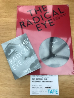
I visited the Radical Eye exhibition at Tate Modern on Saturday as part of an OCA study trip. It is (according to the Tate) the greatest private collection of modernist photographs ever displayed and has been collected by Sir Elton John over the last 25 years.

2017-04-24-14-29-46.jpg

Initial thoughts were wow! what a wonderful collection to own.

The first thing I noticed was a vast difference since my last exhibition visit to William Eggleston in the way I was looking at the images and analysing them which was interesting. I made lots of notes on images that I wanted to look back on for my next assignment which was useful; as well as trying to establish where my interest in photography was drawn to.

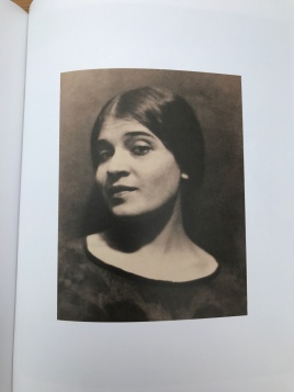
There was one image which for some reason irritated me, it was an Edward Weston (Whom I like) entitled ‘Tina reacting’ (Below), it somehow seemed off kilter , its fine when I view it in the book so I’m guessing this may be more to do with the framing than the image itself but it was interesting to note.

2017-04-24 17.21.02

Elton John is very evident in the collection, the frames seem too ostentatious for the images and you are aware that the images are curated in a similar way to how they are hung on Elton Johns walls.

I have mixed feelings on this as on the one hand he could be a collector that simply stores his collection in a vault whereas on the other hand ( And I like to believe this is true of Elton) they are collected to be enjoyed. Hung on his walls , however packed together, to be looked at daily as they were meant to be. It shows a love of the photographs rather than an investment and I like this thought. It makes me think that if one day I should take an amazing image I was proud of would I want to put it in my loft or on my walls? Some of the frames do unfortunately distract from the photograph.

2017-04-22 12.35.00

I absolutely loved the Irving Penn portraits but was surprisingly not as keen on some of the Man Rays, although I do like the glass tears photograph. I am drawn to looking at eyes in images and I didn’t feel that The Man Ray images were as strong in the eyes as the images of Walker Evans or Dorothea Lange, or maybe its the story I feel that lies behind the image that changes this perspective for me? The Irving Penn’s really showed the character of the sitter and the corner angle and possibly the curation made this set really strong. The Walker Evans and Dorothea Lange are more documentary in style and I was please to see a Helen Levitt in the collection.

There was one image (Below) however that did seem really misplaced, it has been placed in with ‘perspective’ and did not fit at all so it did make me wonder why? was it trying to say something by being so misplaced?

2017-04-24 17.17.26

Another image in the collection which intrigued me was by Ilse Bing titled  ‘Greta Garbo Poster’  I was convinced there was a little face peering out near the hotel sign although in truth I think it was just part of the building… funny how your mind can play tricks on you. Looking at the image printed in the book it is clearly part of a building but looking at the image in the flesh it looked more like a face which does make me question how authentic an image in book or on screen really is to the original.

2017-04-24 17.20.04

Overall I really enjoyed seeing this collection and it is wonderful to see images in the flesh as opposed to on the screen or on a printed page.

It would be interesting to know what other images were in Elton’s collection, perhaps they could have listed them and to know why it was these images that were chosen, I did purchase the book so I will see if there is any hint to what else might be in his collection. But at least they are enjoyed and seen.

I have come away with a long list of photographers to look into, some ideas for part 4 languages of light and lots of inspiration.

I want to experiment more and be more creative, maybe by manipulating images or adding another element, I think (Time allowing) I might start a separate scrapbook to my OCA work to experiment more and take risks, perhaps I will add some to my blog but I feel I need to explore being more creative, after all I do have a whole craft room at my disposal!

**Images of photographs taken from The Radical Eye Exhibition Book purchased on 22.04.2017.


Phew!

I have just been reading through my new copy of  ‘Magnum contact sheets by Thames & Hudson and I have realised I am normal! On one of the pages relating to Elliott Erwitt it quotes Elliott as saying:

It’s generally rather depressing to look at my contacts, one always has great expectations, and they are not always fulfilled. But then eventually when you get to printing them and living with them, sometimes they become better. I don’t always like to look at contacts because it’s work and you can make mistakes, but it’s part of the process. You have to do it…because very often you don’t see things the first time and you do see them the second or third time.

Another quote in the book attributed to Cartier-Bresson says:

A contact sheet is a diary of experiences, a private tool that records mistakes, missteps, dead ends – and lucky breaks.

That describes my contact sheets so far, dead ends however I am still hopeful for the lucky breaks. I am taking on board Erwitts theory to see them time and time again and strangely I have a few preferences emerging.

I have tried posting to Instagram to gain some feedback to see if people take more of a liking to particular images that I am leaning towards.

One more day of shooting left before I myself will have to get decisive!

Research – William Eggleston

Eggleston, a pioneer of colour photography, has a snap shot, vernacular approach. In a similar way to Stephen Shore, William Eggleston appears to document what he sees as he sees it. Eggleston was born in Memphis and many of his images are from this area. I was fortunate enough to visit the William Eggleston exhibition at the National Portrait Gallery in August and seeing the images in print made a difference in how I think I responded to them, they had more impact in print but I was more fascinated by the story that went along with them. His images are heavily saturated with colour which I liked, the reds seemed to add an eerie /macabre twist to some of the images and the placement of colour in the images was extremely important and not always coincidental. Words and signs also seem to appear frequently in Eggleston’s work, however his work to me is all about the colour.

Eggleston is quoted as saying

‘I had this notion of what I called a democratic way of looking around; that nothing was more important or less important’.

One image that stood out to me was the image of the two men standing by a car, one man is dressed in a black suit and the other appears to be a servant dressed a white suit, both seem to mimic each other’s stance but knowing that Eggleston photographed in the Deep South it throws a very different light on the meaning behind the image. The colour contrasts of black and white as well as two men seeming similar in stance yet worlds apart. This is where I feel Eggleston differs from Stephen Shore, both have used a snap shot approach and taken banal images yet I feel there is an underlying story to Eggleston’s work which I do not get from Shore. Eggleston is more experimental in the angles he chooses and looks up and down as well as forwards, the subjects may be everyday common place but they appear more abstract with the change in view or the high saturation of colour.

The famous Eggleston image of the tricycle shows how a different angle has made all the difference, The bright red handlebars contrast with the almost non-existent sky, The green seat of the tricycle and the home in the distance. Who owns the bike? Where is the child? The handles and the seat looks so colourful and new, just the wheels and the handlebars are rusty?

His iconic image of a blood-red ceiling with what appears to be white spider legs of cables took on a new meaning when I read the notation next to the image about the murder of Eggleston’s friend to whom this ceiling belonged.

http://www.egglestontrust.com/


William Eggleston portraits

I managed to squeeze in a quick visit to the National Portrait Gallery while I left the children hunting for Pokémon in St James’ Park.

The gallery was extremely busy but the photographs were amazing, so much better to see them in person to really appreciate them. His use of colour and the composition of the photographs really interested me, I have discovered a few new favourites. I would like the chance to go back and view these again on a quieter day to fully appreciate them more.

His first ‘practise’ colour photo was apparently the photo of the trolley boy in Memphis, Tennessee, wow, I love the golden light hitting his face and casting the trolley boys shadow in profile onto the side of the store. It makes me think this is the evening light and he is bringing the trollies in for the night. Is the out of focus lady behind too late to shop? The car park behind does appear empty.

The photograph of Marcia Hare in the floral dress laid out on the lawn is another photograph I was drawn to. The way that the focus is just on her face and across her arms toward her camera. The buttons on her dress standing out. Was she laying out catching the sun, was this the after effects of a party or was she high maybe? There is a sense of peaceful euphoria in the image.

A few other stand outs were the well groomed lady sitting on the kerb besides the chained up pole, it seems so contrasted and the photograph of Eggleston’s uncle with his driver just behind him mirroring his pose.


Book list

I seem to have built up quite a reading collection which I am gradually working through as well as the odd dip in and out of books. I am finding that it is often easier to dip in and out. My list of books obtained and being used for research is as follows:

Why it does not have to be in focus – Jackie Higgins

How to read a photograph – Ian Jeffrey

Icons of photography the 20th century – Prestel press

Reading photographs – Richard Salkeld

Behind the image – Anna Fox and Natasha Caruana

Photography the definitive visual history – Tom Ang

Approaching photography – Paul Hill

The photography reader – Liz Wells

Complete guide to digital photography – Ian Farrell

Photography – John Ingledew

Contemporary photographers – St James press

The genius of photography – Gerry Badger

Read this if you want to take great photographs – Henry Carroll

Photography: The new basics – Graham Diprose and Jeff Robins

The photograph – Graham Clarke

The photograph as contemporary art – Charlotte Cotton

Photography the whole story – Juliet Hacking


Approaching Photography

by Paul Hill

An interesting book which is easy to digest, it concentrates on how the camera sees and how we see, both visually and artistically. It explores the communication of images, signs, symbols and metaphors. It is filled with an excellent range of memorable photographs and examples and it is a book that I will revisit on occasion.

Basics – Creative Photography

Reading Photographs – Richard Salkeld

A useful book looking at the theory and meaning of images, it includes a number of case studies and various genre. A good starting point in understanding theory.

Behind the Image – Anna Fox and Natasha Caruana

Another book in the creative photography series, this one focuses on research in photography. I found this really useful in starting out and trying to piece my multitude of thoughts together in a coherent way. It looks at planning and developing your research as well as practise and reflection and explores the ways to present this.