Read the reviews by Campany and Colberg and, if you haven’t already done so, use them to begin the contextual section of your learning log. Try to pick out the key points made by each writer. write about 300 words.
If you wish you could add a screen grab of an image from Ruff’s jpeg series, and one or two of your own compressed jpegs (taken on auto mode of course!). You can achieve the effect quite easily by resizing a photograph to say, 180 x 270 pixels, and saving at ‘zero quality’ compression. If you use Photoshop’s ‘save for web’ you can see the effect immediately without having to save, close and reopen the file.
Having read both reviews I found David Campany’s article to be a ‘truer’ review. In the article by Colberg I felt as though it was more of a book review (Which evidently from looking at the bottom of the page it was). There were links embedded which took you to the book on Amazon (Two conflicting reviews on Amazon I might add) as well as credit given to the producers of the book. I also noticed a link to Colberg’s blog, the link didn’t work but I was able to look the blog post up using the Wayback Machine. Interestingly he wrote the blog only 11 days before this review and it has a very different tone. In the article he states
‘I had been looking forward to the publication of Jpegs ever since I first heard about it, since I had a hunch. As it turns out my hunch was correct: Ruff’s jpegs work amazingly well in book form.’
He had even cited Ruff as one of the most creative and inventive photographers of our time. However in his blog post just 11 days prior Colberg says
‘I thought it was a very interesting idea, visually very intriguing, but I also had the nagging feeling that the whole series maybe didn’t contain much beyond the basic idea itself’.
He goes on to say
‘I thought the whole idea had turned into some sort of shtick (Or gimmick if you prefer that word)’
He also says
‘Once you’ve seen that, you have, well, seen it. Time to move on.’
Campany’s article explores the idea behind the images, the way it explores our digital world and how photography has evolved. It mentions digital re-archiving and the internet and explores the concept that Ruff was trying to portray. We live in a digital age and a photo heavy age where images are taken on a whim and stored somewhere forever more. The authenticity of a photograph and the grain of an image are becoming redundant and images are now merely a collection of squares computer engineered to make up a whole. Ruffs work to me seems to show the image not only as the squares but if viewed from a distance the ‘bigger picture’. Campany remains objective throughout his review and even adds a note to suggest that the work is better experienced as printed matter yet does not impose his own personal response.
These are two of my images which I have resized and saved at zero quality compression, For the image of the orange I have shown it in both forms. The top image of the orange is resized with zero quality compression and the bottom image is in its ‘normal’ view to give a comparison.
Select six or eight images that you feel work well individually as compositions and also together as a set. If you have software for making contact sheets you might like to present them as a single composite image. Add the images to your learning log together with technical information such as camera settings, and one or two lines containing your thoughts and observations.
This has confused me slightly as I am not sure if this is meant to be from the pictures I shot in exercise 1.4 frame or other images? I have used some pictures I took on my LX-100 a short while ago before completing this exercise to see if I can find any composition elements. The images below use line to track the eye along the images and a sense of depth, and in the ferry sign and crates I have tried to flatten the focal plane. They work well together as set, I did notice however the amount of images I have taken that are not composed so well now that I better understand how to look at my images in a more analytical way.
The final exercise of this project makes use of the viewfinder grid display of a digital camera. This function projects a grid onto the viewfinder screen to help align vertical and horizontal lines, such as the horizon or the edge of a building, with the edge of the frame. If your camera doesn’t have a grid display, imagine a simple division of the viewfinder into four sections.
Take a good number of shots, composing each shot within a single section of the viewfinder grid. Don’t bother about the rest of the frame! Use any combination of grid section, subject and viewpoint you choose.
When you review the shots, evaluate the whole frame, not just the part you’ve composed. Take the same approach you used to evaluate the point and line exercises: examine the relationship of the elements to the frame. Composition is part of form and formal analysis will be a useful skill for your exercises and assignments as you progress through the course.
1
2
3
4
5
6
7
8
9
10
11
12
13
14
15
16
17
18
19
20
21
I decided to try something out of my usual comfort zone by including people in my images and I chose people in the park as my subject, in fact these were strangers! Although the shots are not technically great I was really pleased with the different feeling I had to these images as they seem to be more animated. I was too busy attempting to line up the division of the frame as well as being inconspicuous and trying to capture (in some of the shots) a ‘moving target’. I am definitely keen to explore taking more images of people, I am drawn to the images and find I am wondering who they are and what happened next? I did feel awkward especially as some of my pictures included children so I will need to consider how best to approach this going forward.
I was a little unsure to the exact point (No pun intended) of this exercise, however the main lesson I have drawn from it is that not centralising the composition makes it stronger and more interesting. I actually much prefer many of these shots with a few exceptions, maybe the subject has helped as I am more ‘interested’ in the image, but considering the framing, point and lines in the compositions has made me seem them in a different light.
Image 1. I am drawn directly to the jogger and especially the colour contrast of his orange shorts against the green grass, the path leads my eye across the image and I follow the other path upwards, however it does cut the frame in two and it renders the bottom half of the image as insignificant. it is interesting that the people on the path in the top corner of the image all appear to be travelling in the same direction of the jogger. I feel that this image may have worked better if the joggers image was composed in the bottom left or right of the frame.
Image 2. I immediately look to the man and child, again a path has intersected the image, however as it is much lower down in the frame it merely then draws my eye along and across to the shadows ,which stretch out across the grass towards the man and child, and along the path at the top. My eyes seem to almost follow the frame , I wonder what they are doing and also wonder about the young man sitting not far from them.
Image 3. I am interested in this photo, I composed the photo to include the two people eating lunch on the bench however I am drawn to the lady who almost appears to be hiding behind the tree. What is she doing? Who is she looking for? My eye is effectively drawn between the bench and the lady.
Image 4. This is a similar image to image 2 however I was a little closer so the path and the shadows are no longer in view. Another family has set up behind the man and child but in this case I am drawn between the two points of the man and child and the younger man. Again this is another image which would have worked better I think if I had composed the man and child in the lower left as there is a lot of ’empty’ space.
Image 5. There is much more happening in this image. I was focusing on the family in the bottom right and the man with the kite. The kite seems to direct my vision to the tree and sky and I notice the tip of a building dome peeking out. The line on the left of the image created by the path and the people help my eye to be drawn back to the man with the kite, however it also helps me to notice the man with the cycle and the dog by the tree. I feel as though I am a viewer to this scene, it puts me in the frame, perhaps because of the sense of depth as well as space in the frame.
Image 6. Again I feel witness to this scene, perhaps again due to the sense of depth. I focus on the family with the pram however my eye then follows the line of trees across an imagined horizon and back to the path to look at the people with the bike. There is no tension between the two sets of people as my eye seems to comfortably sweep across the image.
Image 7. An image of a boy learning to ride his bike, I like the way the path draws my eye down towards to boy however there is a lot of wasted empty space at the bottom of the frame that adds noting to the image. this would have been better if I had placed the boy learning to ride towards the bottom right of the frame.
Image 8. This images places the focus in the bottom right and my eye naturally tracks along the path towards the man standing with his camera. It leads me to look in the direction of his camera to see what he is focusing on, what can he see?
Image 9. The focus is obviously the two men sitting on the grass, again there is a lot of empty space in the image but I do find myself looking around trying to understand their ‘story’. There are trainers but the man in the checked shirt does not seem to be dressed ‘sporty’. Did he meet up with other man who perhaps jogged to meet him? My eye notices the football, is this theirs? My eye follows the path the people on the bench, do they own the ball? No it definitely belongs to the two men. On closer inspection I see there are two sets of trainers so now I think they were both kicking the ball around, there is the top of what looks like a wine bottle peaking from behind their bag, are they friends or is this a date?
Image 10. The line of trees, the shadow lines all draw me to the man and child and the bright yellow coat with the little blue rucksack. I don’t know why but I feel as if they are going home? Something in the mans posture maybe or the fact that he carries his coat?
Image 11. My focus was the jogger with the push-chair however placing her in the bottom right has meant I have captured lots of other people. There is a sense of motion from the mum jogging which when you follow the path contrasts with the girl sitting sedately on the bench in the patch of sun coming through the space in the clouds. I then notice the older couple walking up the path and the people in the distance behind the bench. A girl appears to be holding up a stick. My eyes have wandered around this image taking in much more detail.
Image 12. Here we just have the girl sitting on the bench in the sun. The path in the fore front and the diagonal path all draw your eye towards her. She is the point in this image.
Image 13. This is strange in that I focused on the female cyclist in pink however my eyes do not naturally follow the path/ line in the image but seem to follow the direction in which her head is pointing. The line by her bike wheel should draw my vision up but I look at her head and draw my eyes downwards, I think because the perspective of the other cyclist and the implied horizon shows that she is travelling downhill although the line seems to deceive you. It is almost as if my brain corrects the perspective.
Image 14. This image seems to act as a frame within a frame, the tree, lower path and line of the hill seem to frame the family on the bench. They are clearly the focal point in the image. The teenage boy appears to be downcast or bored, perhaps he didn’t want to endure the family excursion to the park?
Image 15. My eye is drawn up the road into the distance where I take in the people traversing the roadway. The cobblestone line with the double yellow lines provides a strong sense of depth. It is almost an afterthought to look to the couple on the bench whom I had framed in the bottom left. The red colour of the ladies cardigan helps to draw your attention back to them. I then wonder if they might be waiting for the older lady walking towards them on the path. Because of the strength of the line and of the colour red I have been drawn to look at may parts of the image.
Image 16. There is a sense of motion in this shot due to the cyclist, he is clearly the focus however the path and direction he is travelling draw you to the couple on the opposite side.
Image 17. The cobble lines in this image draw me to the cyclist and then the lady walking on the path behind, is she power walking? There is a strength to her implied pace. I then look out along the horizon line at the people in the distance. I feel a spectator to this scene due to the sense of depth and because I feel the power walker has somehow connected with me.
Image 18. I was focusing on the people with the push-chair in the top right however the lines of the path and grass have effectively divided the frame into thirds. It may have worked if they were placed in the lower left. I do look along the path and I notice the man on the bench behind them and the jogger to the right but the image does not hold my interest.
Image 19.I was focusing on the bench with the lady and the push-chair in the top right, this image works well in that I am still drawn to the pushchair perhaps due to the contrasting colours of green and red . I also look down the path into the distance and back along the line of cars. I feel as though I am witness to this scene and I am a part of it, it draws me in.
Image 20. In this I follow the path and the line of trees to the boy on the bike in his bright green coat which contrasts nicely with his orange bike. My eye is also drawn to the red scooter sitting alone on the right. Where is the scooters owner? It is only then that I notice the sliver of a man in-between the trees, is this his dad? The line draws me to them however my focus then stays at the right hand of the frame, there is nothing to draw me back.
Image 21. Ha! I am guessing this is Dad? He looks far too small for the bright green bike. I do look across the line of cars but my focus remains with dad and there is nothing else in the frame to hold my interest. The image amuses me however purely on how ridiculous I think he looks.
My final observations to take forward would be:
To consider where the lines in my images sit and where they take me.
To try framing the picture as sections of a whole frame as well as framing it completely to see if it throws up anything new.
To consider the story in the image and the dynamics between people / objects.
To consider that contrasting or bright colours can also draw your attention
I see framing an image as building the image / composition within the frame at the point of taking the image. This is the initial vision of what you capture through the lens.
Cropping is an edit that happens after the framed image has been shot, it is used to recompose or restructure an image. An image can be cropped to remove elements in the frame that were not wanted or to change the view of the image.
Take a number of shots using lines to flatten the pictorial space. to avoid the effects of perspective, the sensor/film plane should be parallel to the subject and you may like to try a high viewpoint (i.e. looking down). Modern architecture offers strong lines and dynamic diagonals, and zooming in can help to create simpler, more abstract compositions.
Review your shots from both parts of Exercise 1.3. How do the different lines relate to the frame? There’s an important difference from the point exercise: a line can leave the frame. For perpendicular lines this doesn’t seem to disrupt the composition too much, but for perspective lines the eye travels quickly along the diagonal and straight out of the picture. It feels uncomfortable because the eye seems to have no way back into the picture except the point that it started from. So for photographs containing strong perspective lines or ‘leading lines’, its important that they lead somewhere within the frame.
It was much harder to find successful images where I was able to flatten the perspective, most were achieved by either taking the picture downwards as in the image of the post it notes or directly front on. They are interesting images but they have a more ‘abstract’ or ‘detail’ quality. The lines strengthen the shape but I find I look more at the image as a whole rather than allowing my eyes to follow a predetermined route. I feel as though I am looking at an image but I am not part of the image.
Take a number of shots using lines to create a sense of depth. Shooting with a wide-angle lens (Zooming out) strengthens a diagonal line by giving it more length within the frame. The effect is dramatically accentuated if you chose a viewpoint close to the line.
It is surprisingly easy to find lines which add depth to an image. I think the overall effect is achieved not only because your eyes are drawn along the lines and into the distance but because it makes the person viewing the image feel as though they are looking into the image. It represents a ‘real’ image that the brain can relate to, they are / can feel part of the scene. Interestingly I find that the most successful of these ‘real’ images would be where the perspective line meets the horizon or imagined horizon. The shot I took with the mirror reflection line is interesting as your eyes follow the intended path but there is no natural horizon so I find my eyes scanning the scene, I wonder if this is because the brain is trying to make sense of the ‘quirky’ horizon.
You could think about the two parts of this exercise in a different way, as ‘test pictures’ versus ‘real pictures’. The only purpose for the test picture is the exercise: you can analyse them according to the criteria and get the expected answer. But ‘real’ pictures are not so easy to analyse. What are the criteria for ‘relationship’? (We’re hoping that you’ll shoot the rest of the exercises in this course as real pictures, not test pictures!)
As you review your photographs, observe the way your eye ‘scans’ the surface of the image. Note how:
A point attracts attention out of proportion to its size
The eye looks for the connections between two points
Placing a point close to the edge seems to animate both the point and the frame.
Print out two or three of your point photographs and trace the route your eye takes over the surface with a pencil. Then try the same with a selection of photographs from newspapers or magazines. You should notice that each photograph seems to have its own tempo. Add the traced photographs to your learning log together with brief observations.
I have decided to use a ‘real’ image rather than just a single image in a frame for this exercise and I have cropped a photo into a few different placement arrangements to explore this further. I have also explored landscape and portrait framing in my placement arrangements.
1
2
3
4
5
6
7
8
9
10
11
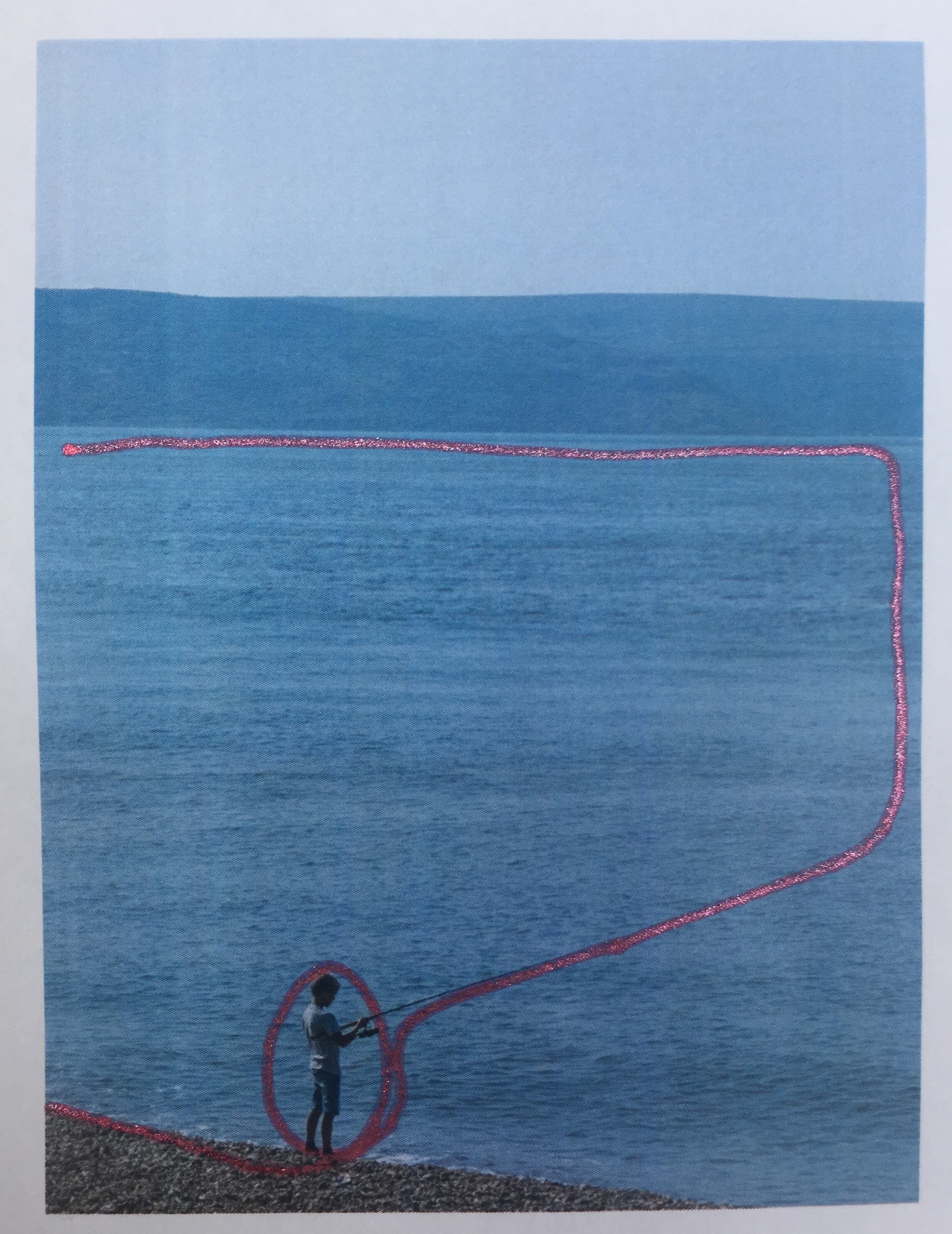
Regardless of landscape or portrait I am drawn to images 1 and 6 as the most balanced . My eye is drawn to the boy fishing and I follow the line of his rod along the shore edge up the edge of the frame and back along the horizon.
Images 5 and 11 are the most boring and add no strength to the boy as I had mentioned in my point exercise earlier however the distance of the subject and angle will also play a part in adding strength.
Image 3 and 8 are too ‘eccentric’ and would need a reason to be shot this way otherwise they do not work as they are too unbalanced.
As your eye is drawn to the boy and then in the direction he is facing it seems wrong to put him to the right of the image as shown in 4, 7 and 8.
I quite like images 2 and 9 because they add a sense of space and the feeling of a small boy in a big world, my eyes are drawn in the same way as the balanced images of 1 and 6 but with this added element.
Image 10 although using rule of thirds and placed in proportion to the frame does not work as the eye is draw to the boy and then along the direction of his rod to the right hand corner but the eye completely misses the bottom half of the image.
There are essentially three classes of position (to place a single point): In the middle, a little off centre, and close to the edge.
(Photography 1:The Art of Photography,p72)
1. Take two or three photographs in which a single point is placed in different parts of the frame.
( A ‘point’ should be small in relation to the frame; if it’s too large it becomes a shape.)
How can you evaluate the pictures? How do you know whether you’ve got it right or not? Is there a right place and a wrong place for the point? For the sake of argument, let’s say the right place shouldn’t be too obvious and that the point should be clear and easy to see. As there’s now a ‘logic’ to it, you can evaluate your composition according to the logic of the point.
1
2
3
4
5
Image one feels unbalanced as my eye is drawn too far to the right without anything to read in the image as my eyes naturally tracks from left to right.
Image two is more comfortable as my eye is drawn from the point to the centre and back in a diagonal, yet I do not seem to scan the rest of the image.
Image three makes me scan the whole image, whilst I am drawn to the point I look around the whole of the frame. This is interesting as this composition uses the rule of thirds, however my eyes do tend to have a tendency to stay focused on the upper half of the frame. My eyes appear to have naturally read from the bottom to top.
Image four although not truly central is the strongest in that the point is the focus and you are drawn directly to the centre. This shows that centralising to the frame can create power, however the eye does not look elsewhere and this is a more ‘expected / normal’ and slightly dull approach unless if you were trying to show strength in a subject.
Image five is the most balanced to the frame, I can take in the picture as a whole including the point, again this image uses the rule of thirds however as the point is placed at a more natural eye line it is the most comfortable to view.
2. Take a number of images in which a point is placed in relationship to the frame. Can you find any place where the point is not in relationship to the frame? If it’s in relationship to the frame you can place a point in any part of the picture and the picture is balanced.
1
2
3
4
5
6
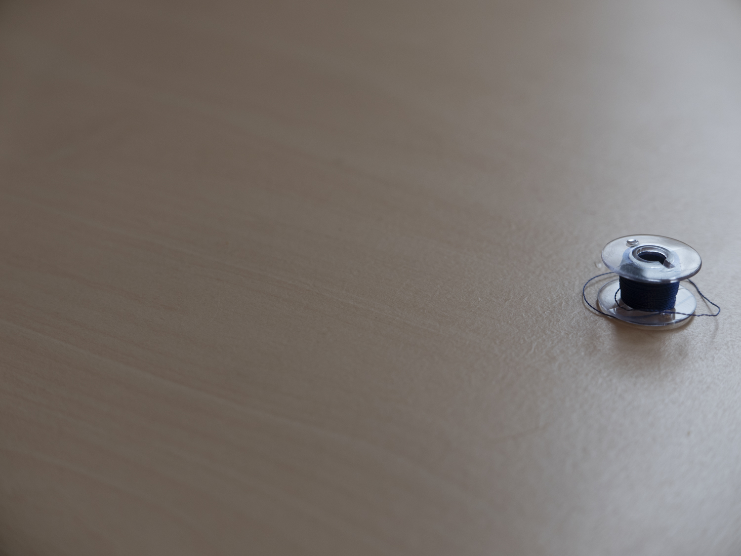
I had some trouble with using auto mode for this as my camera was very reluctant to focus on the bobbin when it was to the edge of the frame.
The only image in which I feel that the point is not in relationship to the frame would be image 2, the fact that it is cut off by the frame loses its importance to the image and I no longer look at the bobbin as being a focal point of the image. Again I have the same observations as I had previously with the point exercise in that image 6 is ‘typical’ and ‘obvious’, the image position I most like is 5 although 1,3 and 4 do still work. Image 3 and 4 are slightly more interesting because the bobbin is in the light which has added another element to the image, the same could be said of image 1 where the bobbin sits in the shadows.
Take three or four exposures of the same scene. Don’t change anything on the camera and keep the framing the same.
Preview the shots on the LCD screen. At first glance they look the same, but are they? Perhaps a leaf moved with the wind, the light changed subtly, or the framing changed almost imperceptibly to include one seemingly insignificant object and exclude another. Time flows, the moment of each frame is different, and, as the saying has it, ‘You can’t step into the same river twice’.
Now bring up the histogram on the preview screen. The histogram is a graphical representation of exposure the camera’s sensitivity to light. As you page through the images you can see small variations in the histograms. Even though the pictures look the same, the histogram data shows that in a matter of seconds the world changes, and these subtle differences are recorded by the camera. If you refine the test conditions – shooting on a tripod to fix the framing, moving indoors and closing the curtains to exclude daylight – still the histogram changes. Probably some of the changes are within the camera mechanism itself; still, the camera is a sensitive enough instrument to record them.
Add the sequence to your learning log with the time info from your camera’s shooting data as your first image for part one.
16:21:47
16:21:51
16:21:54
16:22:04
16:22:37
16:22:40
16:22:44
16:22:48
16:23:12
16:23:16
16:23:24
16:23:28
16:26:27 With Tripod
16:26:29 With Tripod
16:26:32 With Tripod
16:26:35With Tripod
16:28:08 With Tripod
16:28:10 With Tripod
16:28:11 With Tripod
16:28:13 With Tripod
On examining the histograms for all of the sets of exposures I can see that it has changed in every single shot. The addition of a tripod reduced the amount of difference but it did not eliminate it. The more inanimate the object the smaller the changes, for example in the photographs of the spider web it shows a much greater amount of change between the exposures. Presumably this is due to changes in light as well as movement of the web and leaves etc. The smallest amount of histogram difference is in the frog ornament photographs using a tripod. The tripod has steadied the camera so removing variations in the camera positioning and as the objects in the frame are both solid, the frog and the fence, the only movement in this shot would be due to the changes in light.